For our 50 year anniversary, we have chosen to create a new corporate image to represent us, to celebrate this important milestone and to renew ourselves once again without forgetting our history, because “The past has never been so present“.
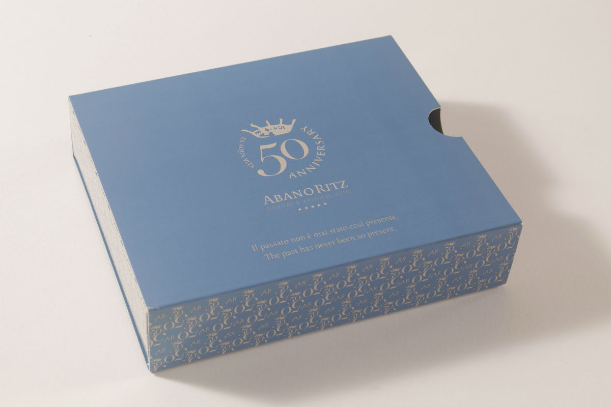
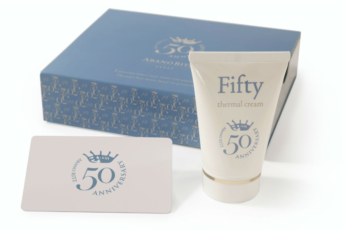
The project consisted in the creation of a new logo, declined in different versions, and a gift box for all guests, which contains our 50 Cream and a luxury card that offers discounts on hotel and territory services. Here is the interview with Marta Donà, the graphic designer that curated the project.
The interview
What is your project? Could you briefly describe it?
The AbanoRITZ decided to celebrate its 50th anniversary, an important milestone, with a small gift for every customer and beloved friend: a gift box containing a card for special discounts and the Fifty Thermal Cream, an anti-age face cream with an exclusive formulation that enhances the benefits of the thermal water (B.I.O.C.E.). My contribution to the project is the graphic development of all these materials: the new logo “50 Anniversary” style, the gift box, the gift card and the customization of the cream tube, with the related choice of the most suitable colors to express the desired concept.
Which elements inspired you? How did you choose the concept of the work?
Some meetings at the AbanoRITZ have been necessary, to speak directly with the management, the Poletto sisters (whose energy and helpfulness I couldn’t stress enough), and to personally experience the style and ambience of the hotel. From the meetings with the Poletto sisters and my perception of the whole place, I understood the message that the gift should have conveyed: first of all, the concept of a tourism with humanity, real, that considers the guest’s satisfaction the keystone of its commitment and its passion. The mix of traditional values and an authentic and innovative offer, that cares for the current needs and gives more value to charme than luxury. Finally, a deserved thank-you to the young guests and the returning ones, who partake in transforming this hotel into a welcoming home. These are the main concepts of my project, that inspired also the graphic look: humanity, family, tradition, innovation, charme, emotion, gratitude, hospitality.
How does these inspirations result in your project?
Almost every graphic element in my project follow the thread of the concepts described above:
- the “50 Anniversary” style of the logo: refined yet decisive, coordinated to the original one with a bit of regality but not too formal, at the same time;
- the texture of the gift box: starting from the logo, I realized a texture that would give elegance and style, a decorative element that creates some movement and balances full and empty spaces, decoration and minimal cleanness;
- the payoff on the front and the short text on the back: the payoff conveys the emotional spirit of the hotel “The past has never been so present”… I don’t think it needs to be explained. On the back, a text that expresses all the concepts told before, a poetry that isn’t just a mere printed text but becomes real everyday thanks to the effort of the Poletto family and all the staff, and whoever has been a guest here before knows it well;
- the choice of colors: this project relies on three main colors, each and everyone contains its meaning and they enhance one another. The white is purity and transparence; the light blue means loyalty and ideals; the “sable” beige gives elegance and refinement. Everyone can freely interpret the meaning of these colors, as we know emotions raised by colors are often very personal.
Which is, in your opinion, the uniqueness of the AbanoRITZ? Is there something that struck you in particular?
For sure the uniqueness of the AbanoRITZ lies on the ability of making a customer feel really a “guest” and part of a family, rather than one among many others. Even if I didn’t stay at the hotel overnight but went only for work meetings, this pleasant feeling lingered on me.


